Level 1 Adjustment and lightning changes
Author: Aleksei Ratnikov
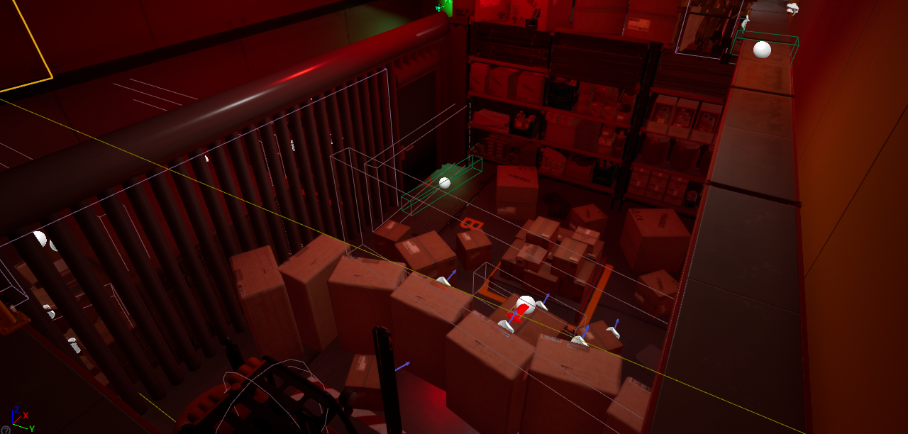
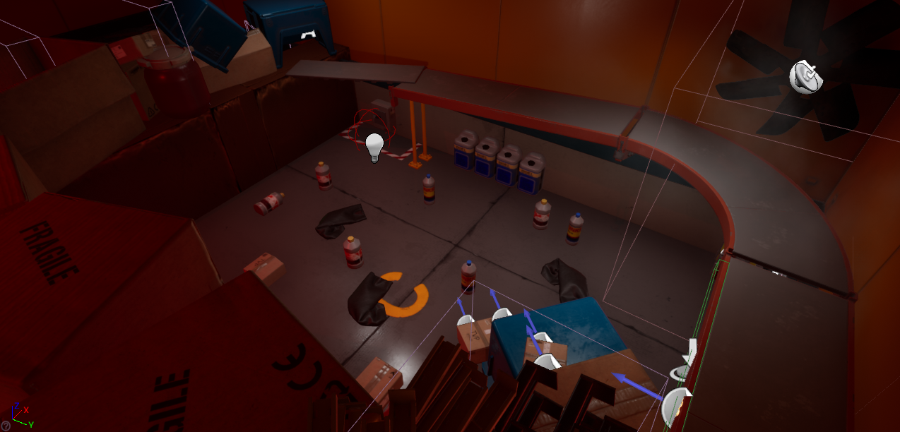
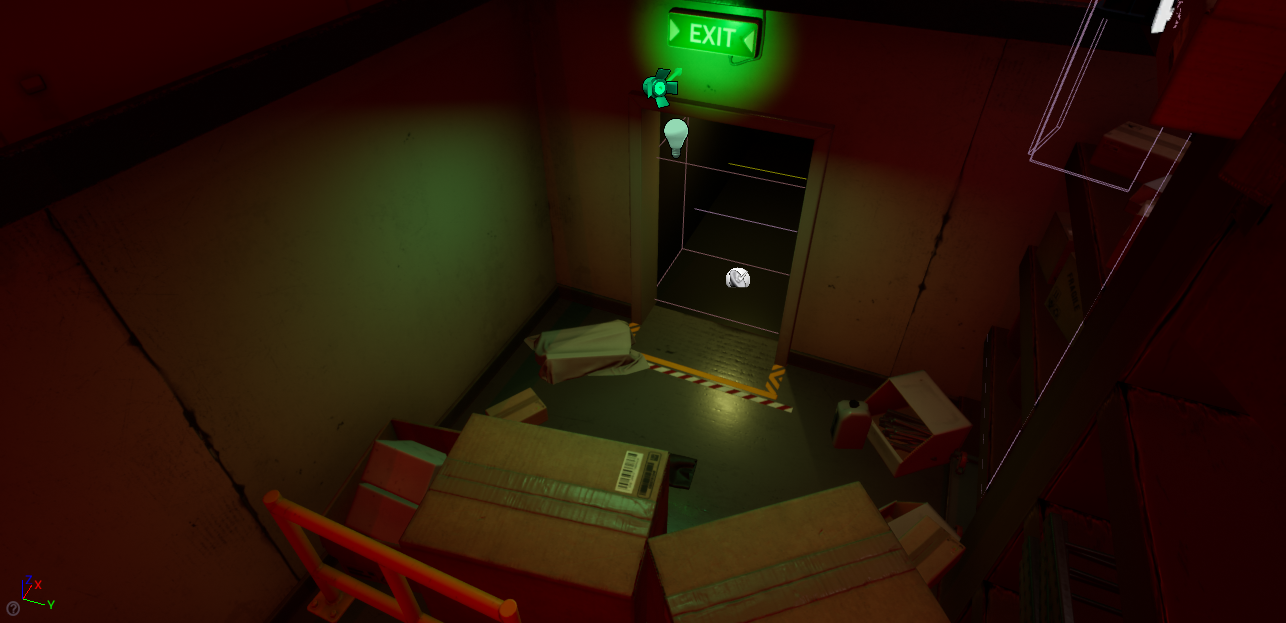
Problem: The level didn't seem to be abandoned and needed longer improvement to give more worrying emotions to the player. One of the issues was that the room was too bright for what I was looking for as well as some of the lights needed to be adjusted and moved around. In the second part, it all looked kind of sorted and not really like something that was sitting there for years.
Solution: The solution for light was to remove the sky of the level to make light completely take control over how the level looks and some of them needed to be removed, adjusted, and moved in the level. First to make it more efficient and more appealing. For the abandoned part of the level I've gone in and added more props to make the room "trashy" as well as adjusted some of the old ones.
Before:
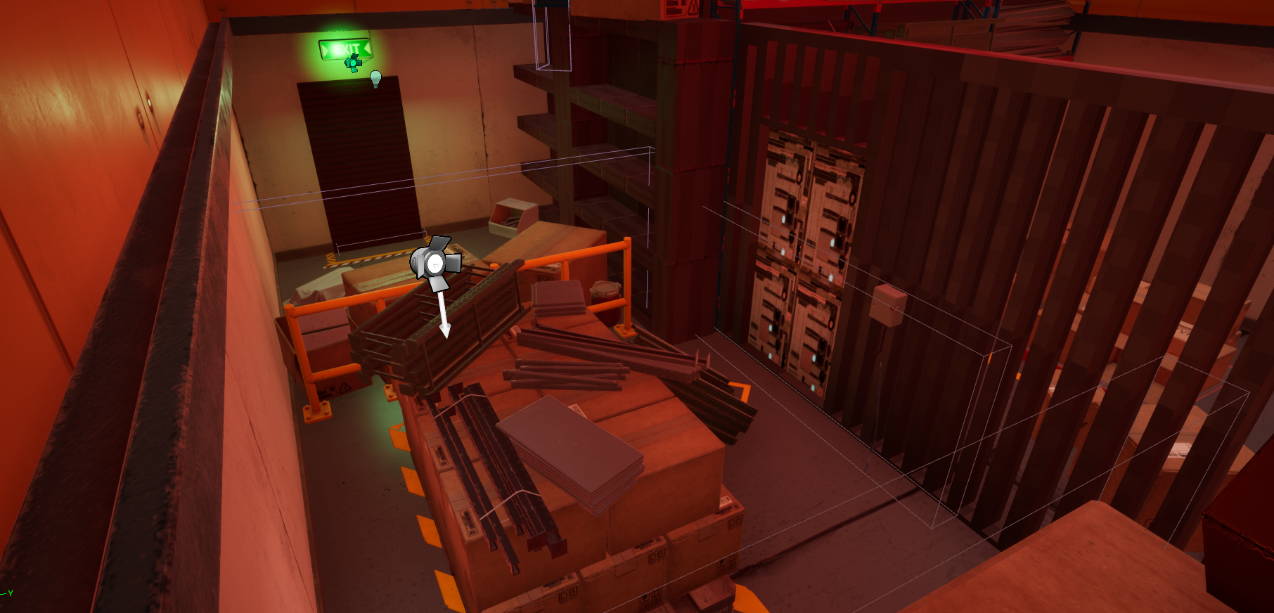
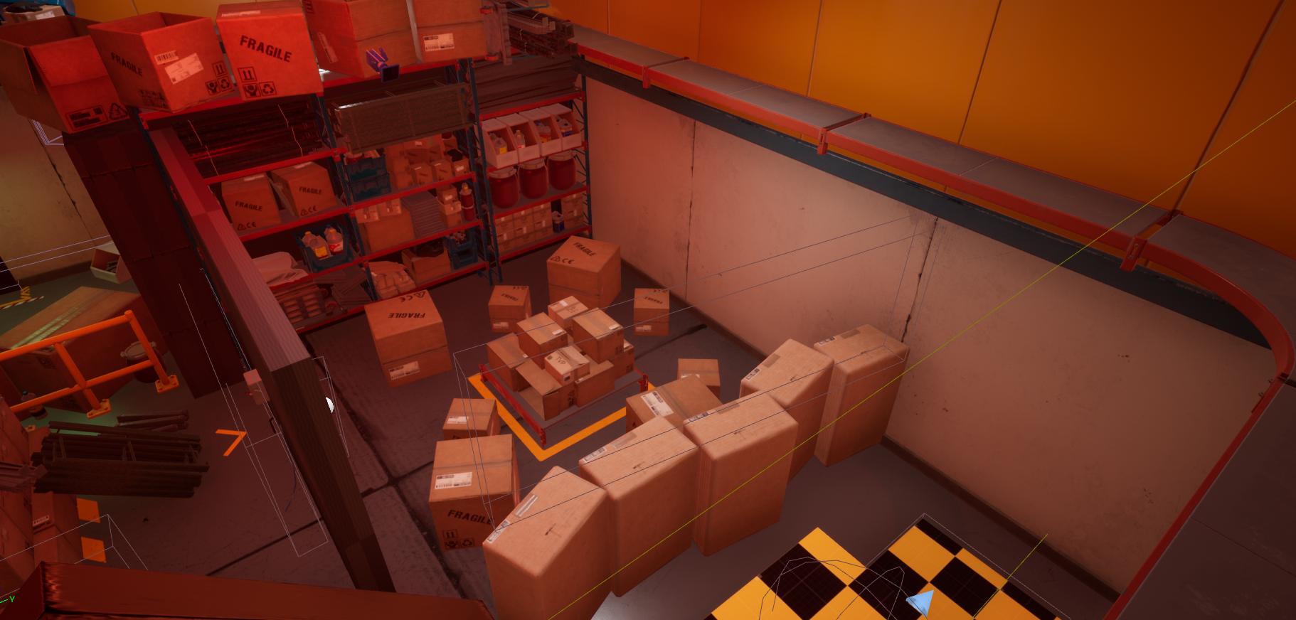
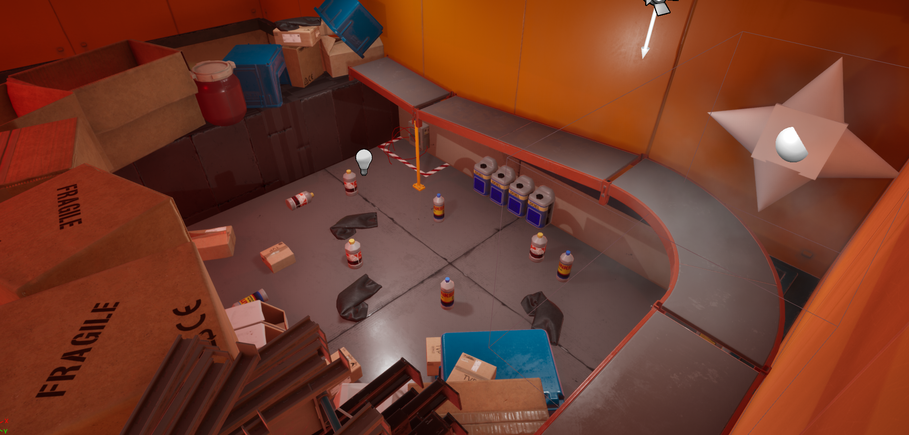
After:
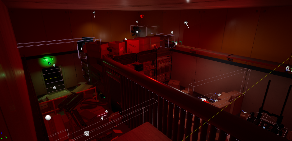
Shutdown
| Status | Released |
| Authors | TheSenate2002, ekicks0, Vrixic, CameronEuston, Boomishhe, mditcharo |
| Genre | Puzzle, Adventure |
| Tags | First-Person, Singleplayer |
| Languages | English |
More posts
- The FinallyApr 27, 2023
- Post Mortem VideoApr 27, 2023
- Fixing issue with Hud not being validApr 27, 2023
- Finalization of GameplayApr 27, 2023
- Circuit Puzzle ChangesApr 27, 2023
- Touching Up SoundsApr 22, 2023
- Level MusicApr 22, 2023
- Getting people to play the gameApr 21, 2023
- Tuning the Lighting in Level 3Apr 21, 2023
- Static Mesh Mass ScaleApr 21, 2023

Leave a comment
Log in with itch.io to leave a comment.